Instagram has refreshed the written logo shown in its interface for the first time in roughly a decade. The change is part of a wider identity system, not a replacement for the gradient camera app icon. VerdictLab reviewed Instagram’s own design material, Adam Mosseri’s announcement and independent design coverage to separate the actual changes from the viral reaction.
- What actually changed
- Why the lettering became controversial
- The business logic behind the refresh
- VerdictLab’s view
What actually changed
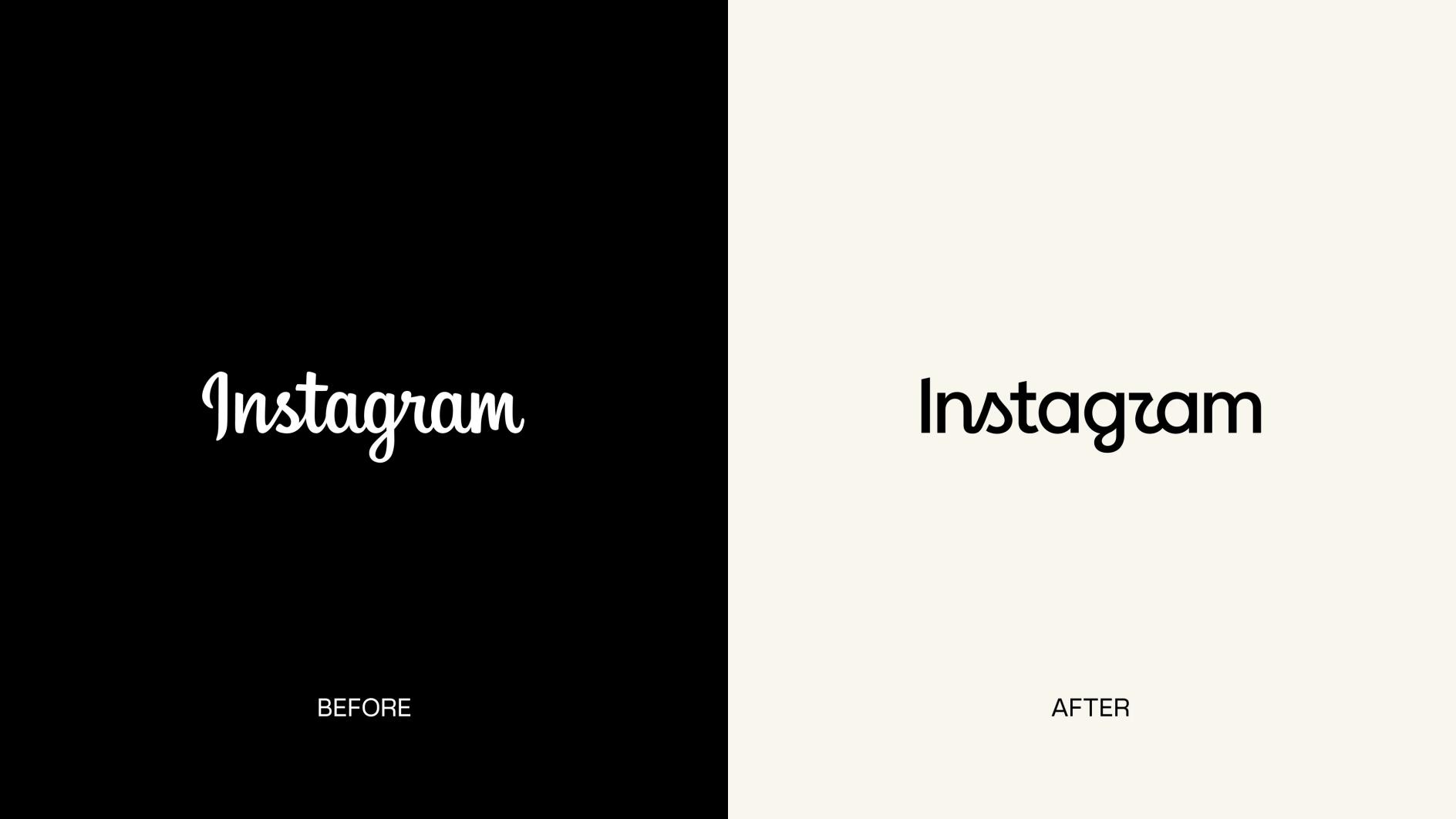
Instagram kept the gradient camera icon. The new element is a bolder, simplified script wordmark, supported by an updated Instagram Sans, the handwriting-style Instagram Pen and Instagram Mono. Meta says refreshed motion and interface treatments will roll out through 2026 and beyond.
Why the lettering became controversial
The connected strokes are meant to retain a personal, handmade quality, but some readers see the final letters as ambiguous. That is a real usability question: a wordmark can feel distinctive while still losing clarity at small sizes. Online jokes are not a scientific legibility test, but repeated confusion is useful design feedback.
The business logic behind the refresh
Instagram now has to work across creator tools, video, messaging, advertising and many screen sizes. A flexible type and motion system can make those surfaces feel related. The redesign is therefore better understood as brand infrastructure than as a single logo swap.
VerdictLab’s view
The camera icon protects recognition while the wider system experiments with a warmer voice. The fair test is not whether the wordmark looks better in a comparison image today, but whether it remains readable, coherent and recognizably Instagram across languages, devices and real interfaces.
A rebrand succeeds only when people can recognize it quickly and use it consistently—not when it merely wins launch-day attention.
VerdictLab editorial note
Original sources
This VerdictLab report is an original summary and analysis based on the reporting below.
- Design at Meta: The new Instagram brand identity ↗
- Adam Mosseri on Instagram: Instagram wordmark refresh announcement ↗
- Creative Bloq: Instagram’s new brand identity is more than just a wordmark ↗
- Creative Boom: Instagram reveals its first brand refresh in 10 years, with a new wordmark and three typefaces ↗
How this was created: VerdictLab selected and checked the cited reporting, prepared an original summary with AI assistance, and translated it for accessibility. We link to the original publishers and do not reproduce their articles.